

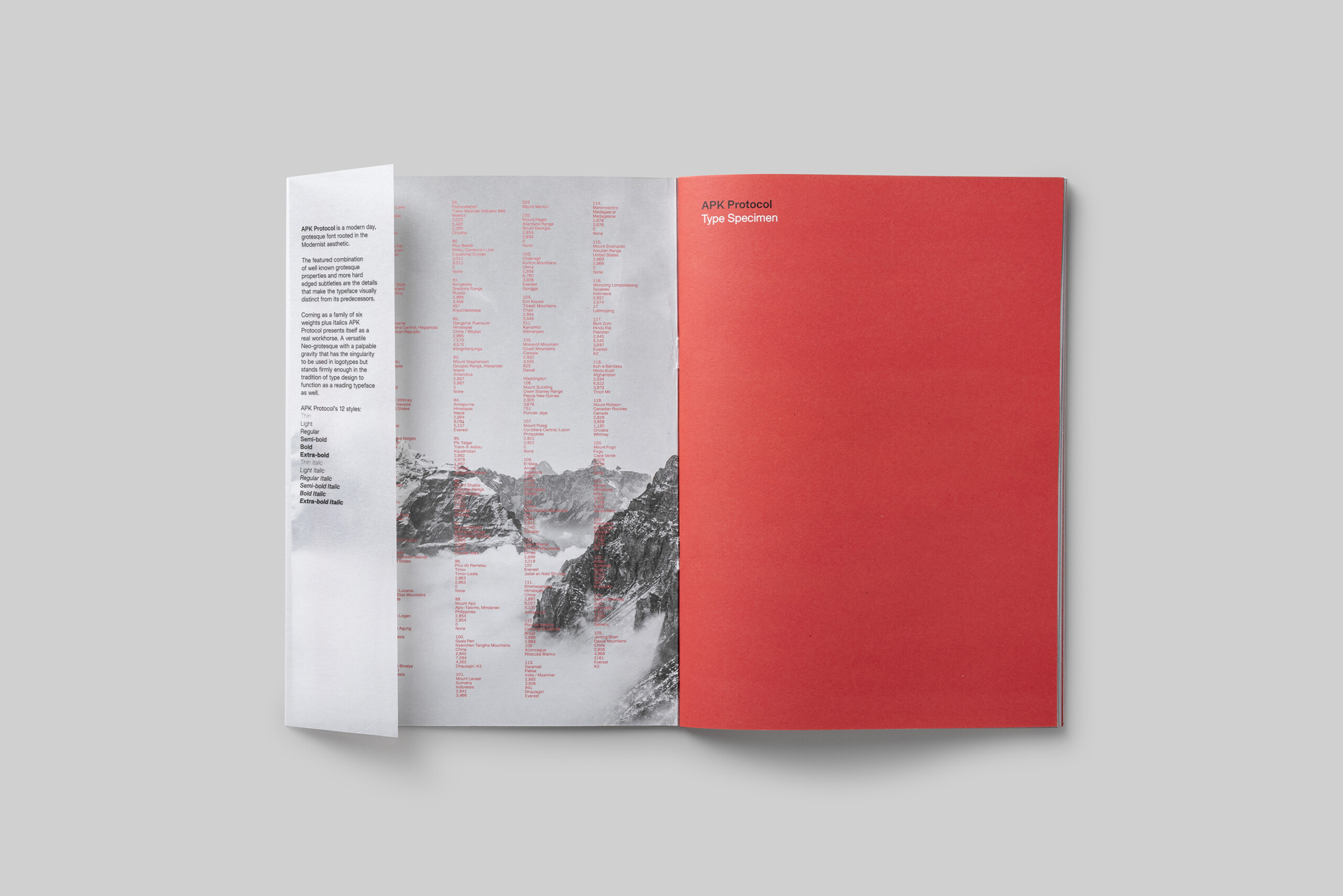
A typeface with a palpable gravity that has the singularity to be used in logotypes and the versatility to be used as a reading typeface as well.
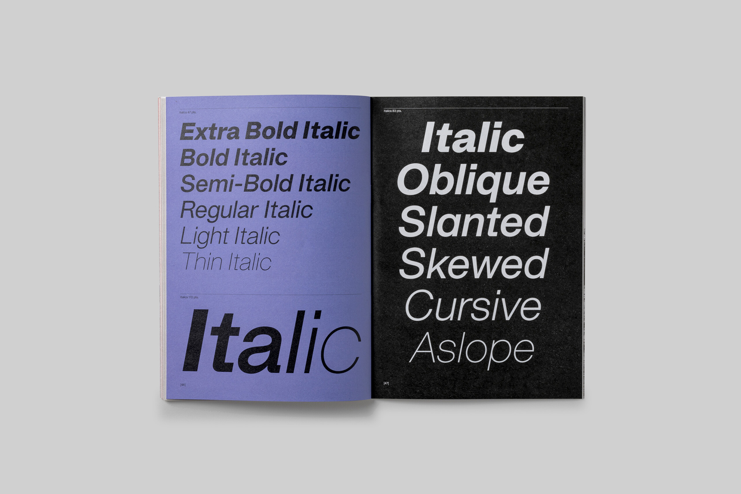
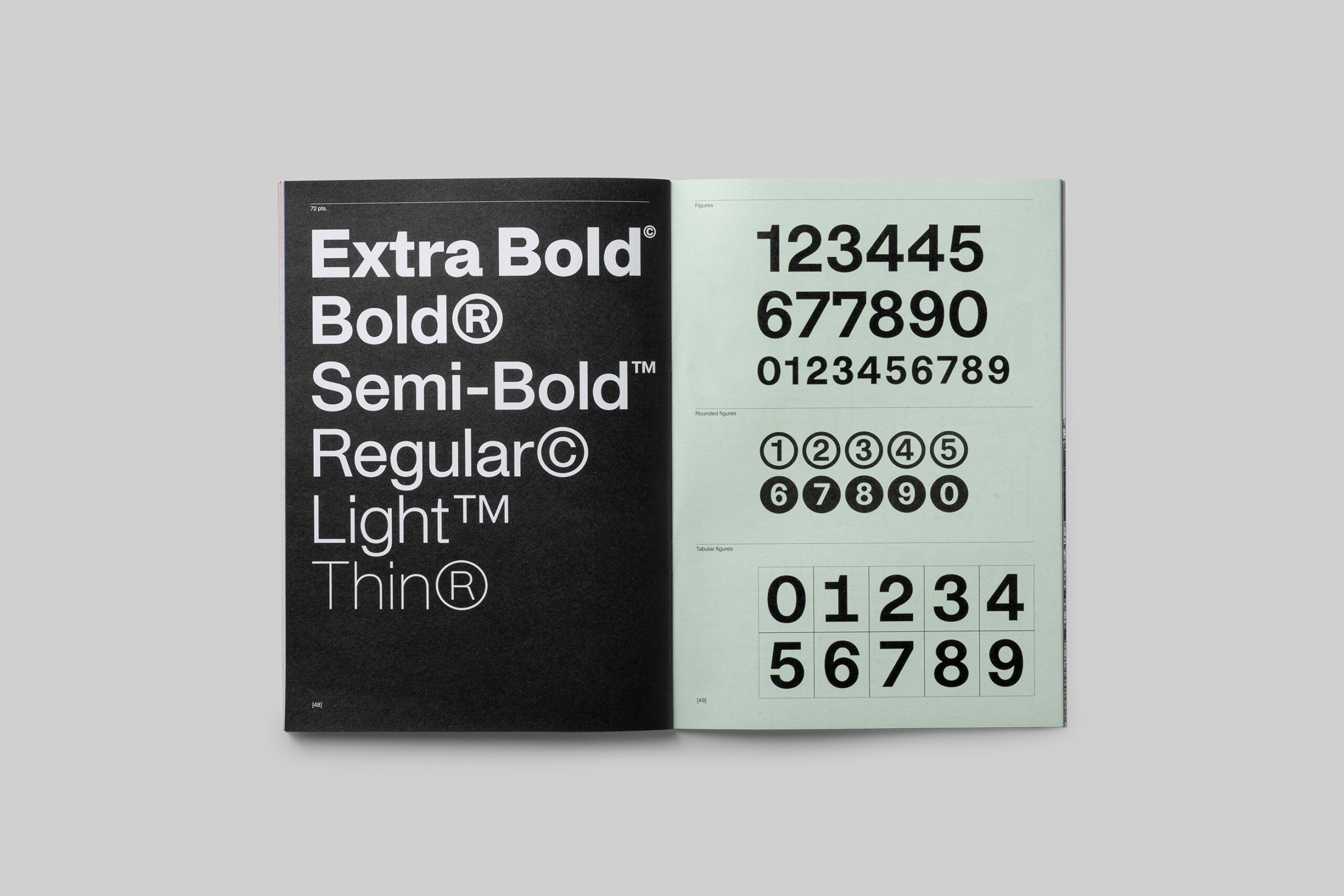
Protocol comes in six weights with accompanying Italics.
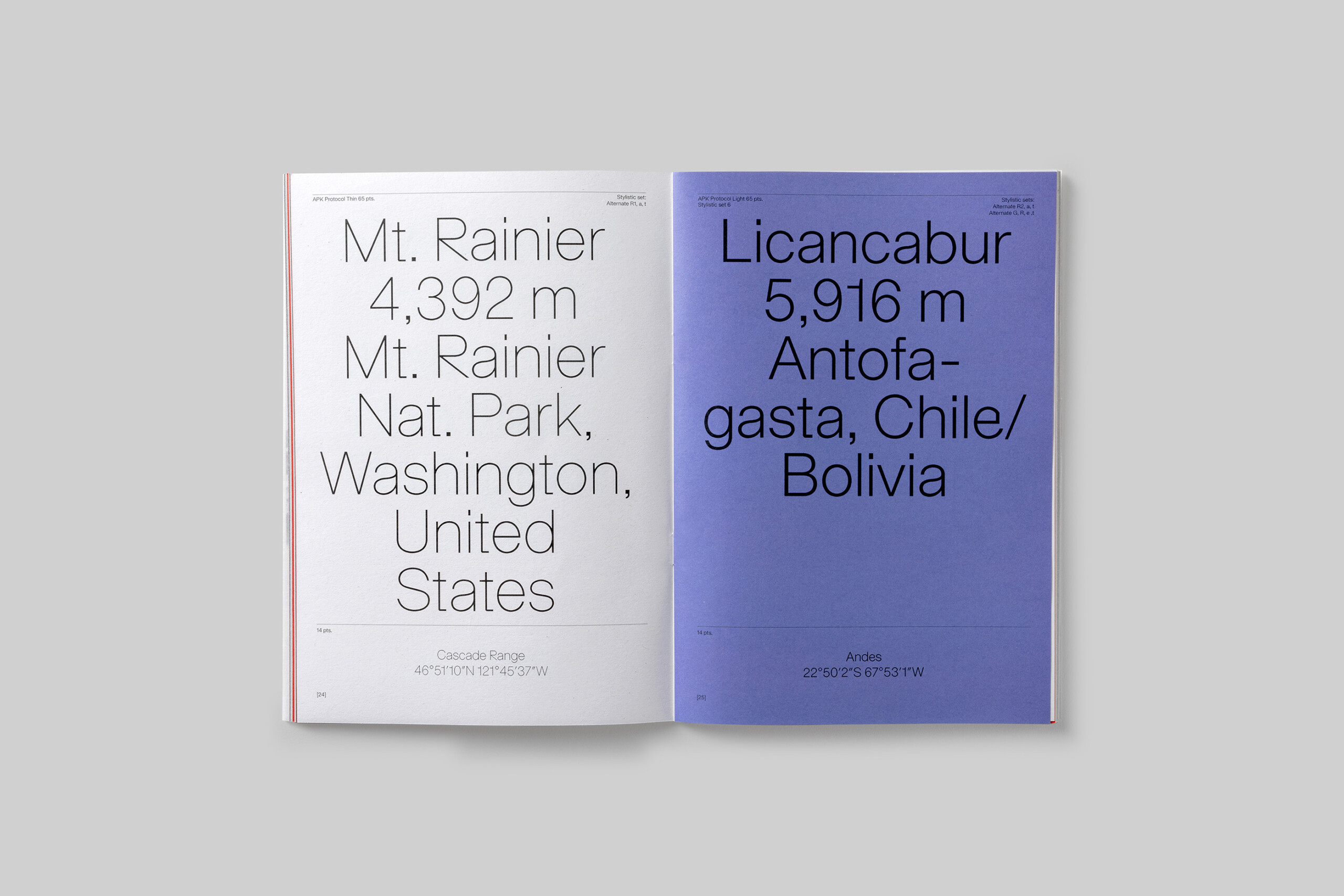
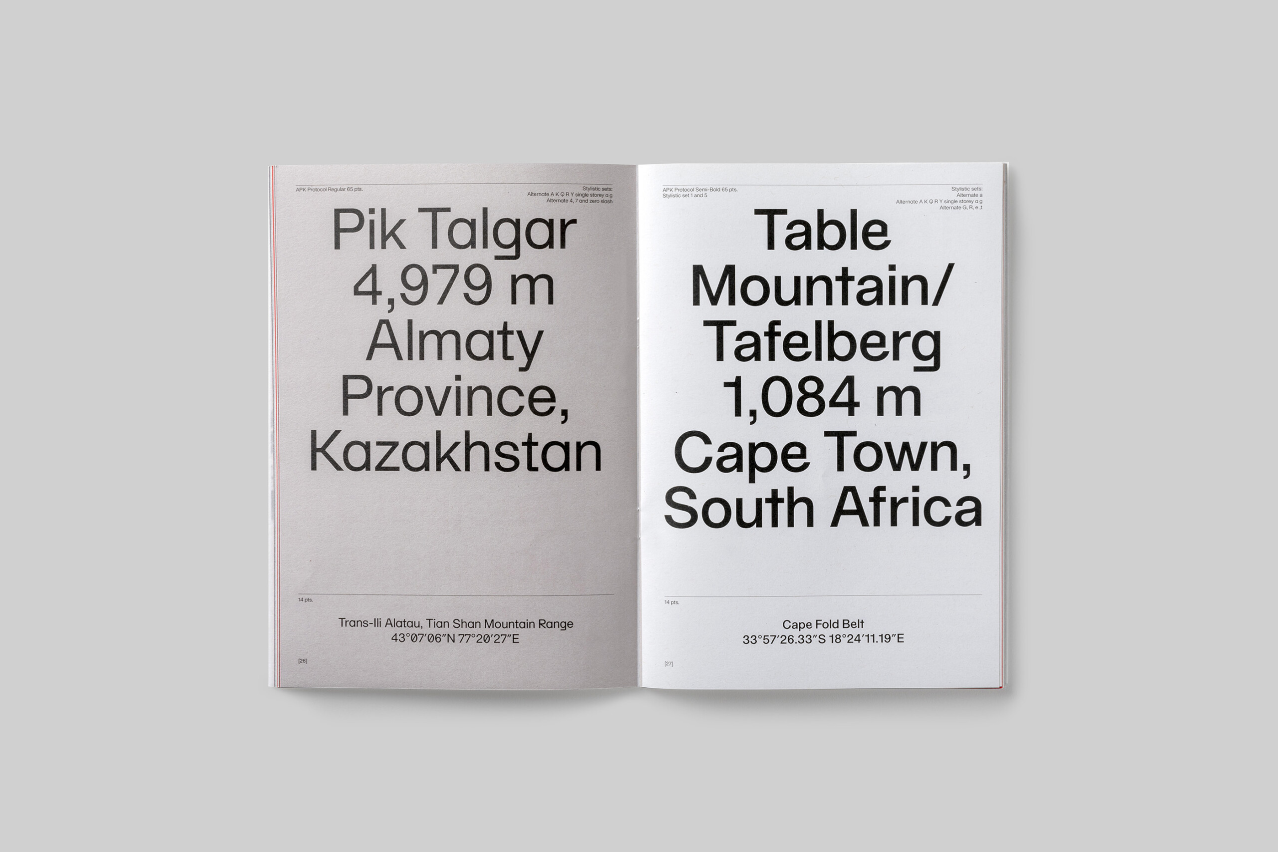
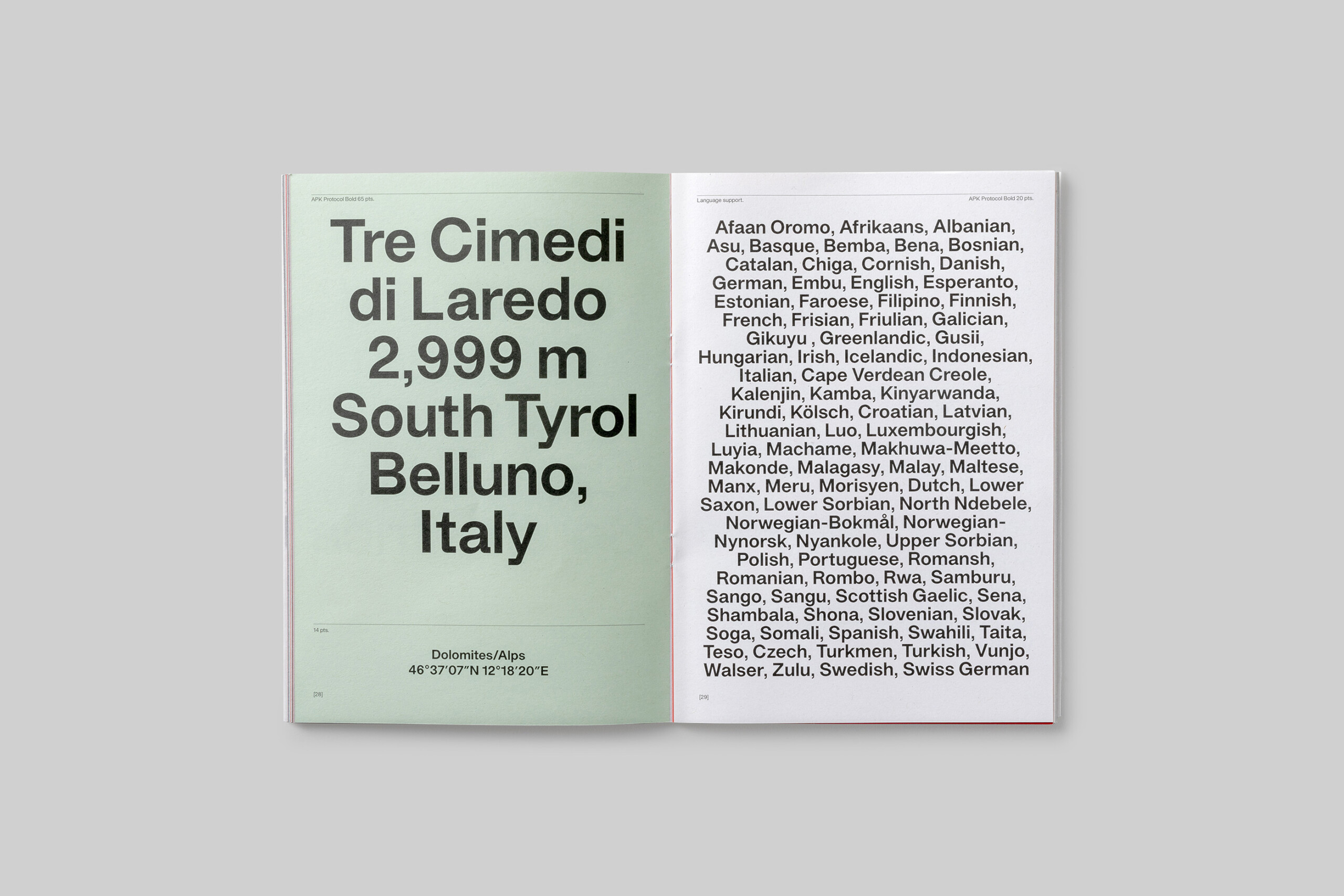
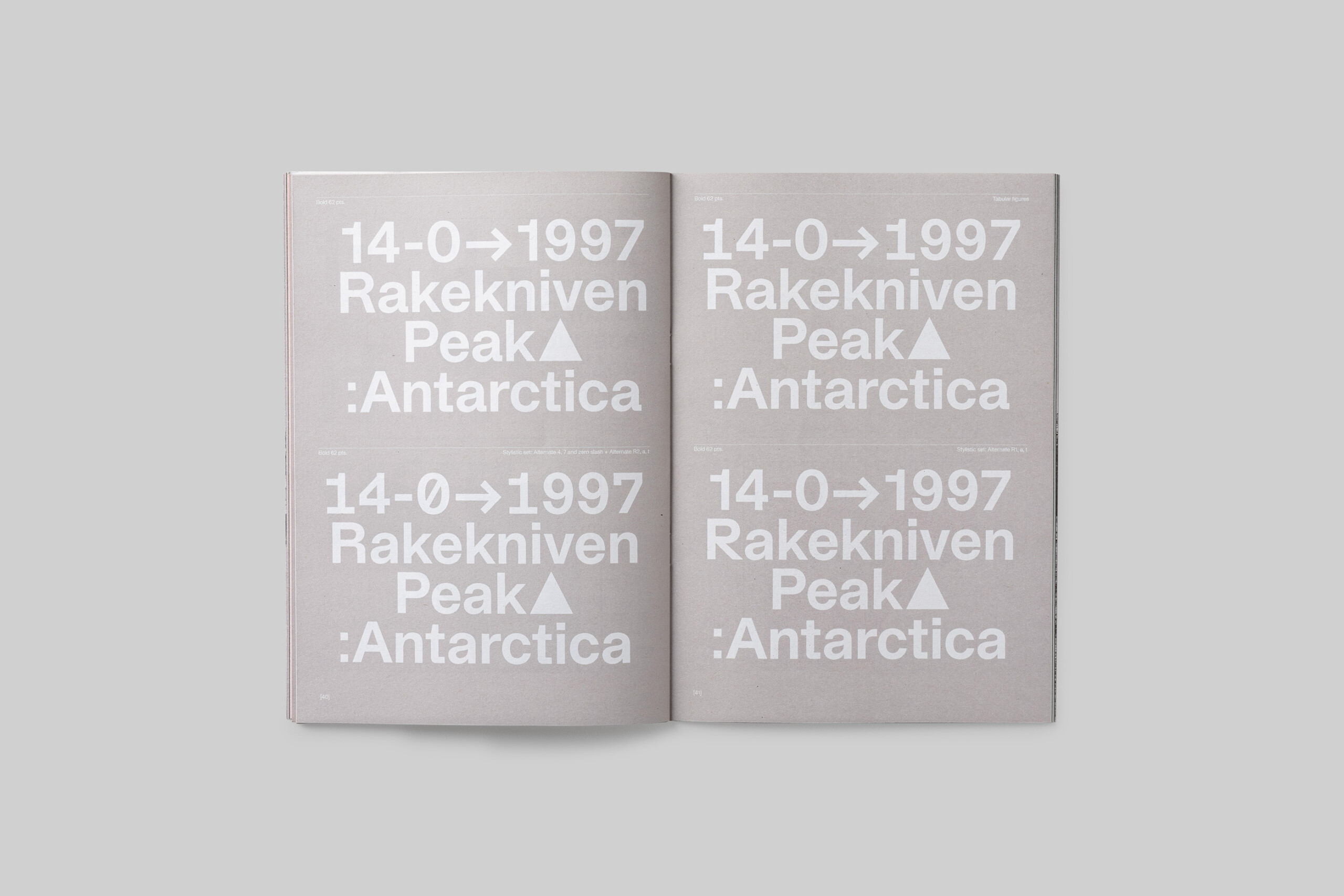
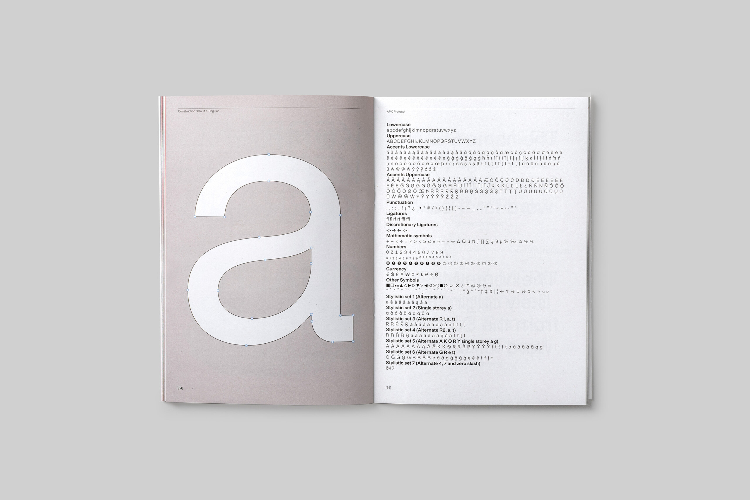
It offers large character sets and seven stylistic sets of alternates across the weights.
BUY HERE


Protocol has a fondness for symmetry and straight lines. All with the intention to take the characteristics (neutral, rational) of the modern day grotesque to the extreme, without losing sight of the very essentials of type design. Next to these aspirations a set of alternates facilitates a more quirky direction in the use of the typeface.
Other notable features of Protocol are a high x-height, the termination of strokes on horizontal or vertical lines and a tight spacing between letters, giving it a dense and solid appearance.


The outlines of the typeface were designed in 2018. In 2020 a beta version of APK Protocol Regular was made. Together with Swiss based type developer Maël Bächtold the Regular was expanded into a complete font family and released in 2021.
BUY HERE
Design APK Protocol
Autograph Peter Korsman
Font engineering
Maël Bächtold
Motion design
Jasper van Doorn
Web development
Buro Meta