In January 2019 the neighboring municipalities Werkendam, Woudrichem and Aalburg merged into Altena. We won the blind pitch and got assigned for the branding.
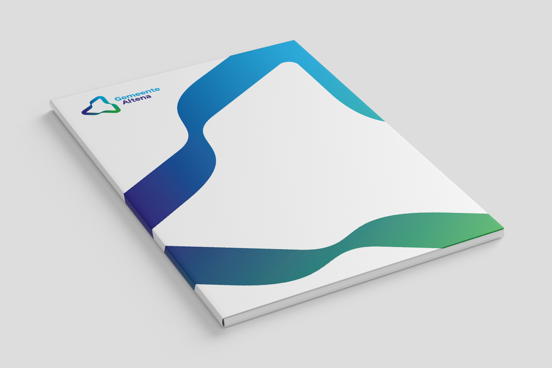
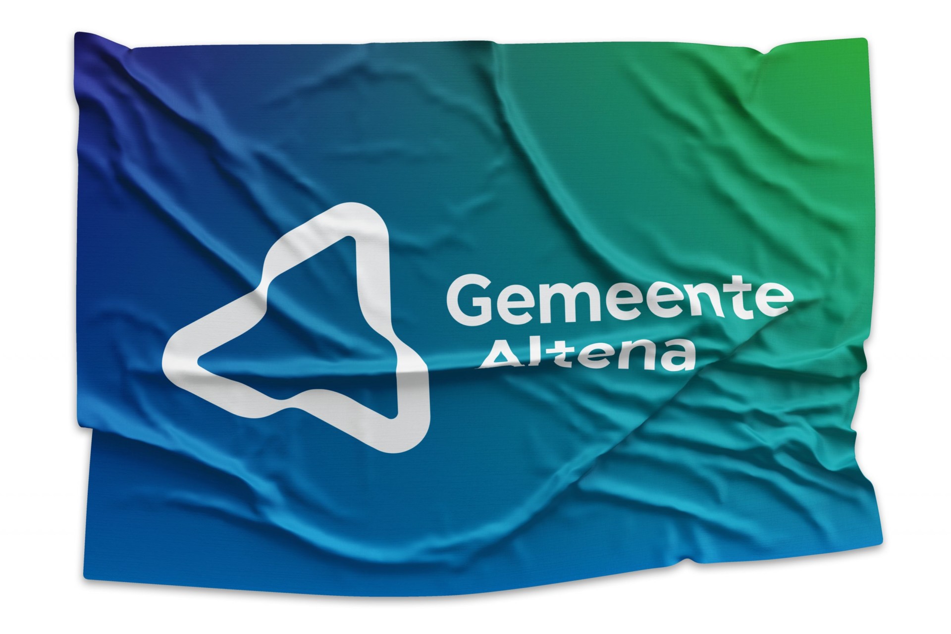
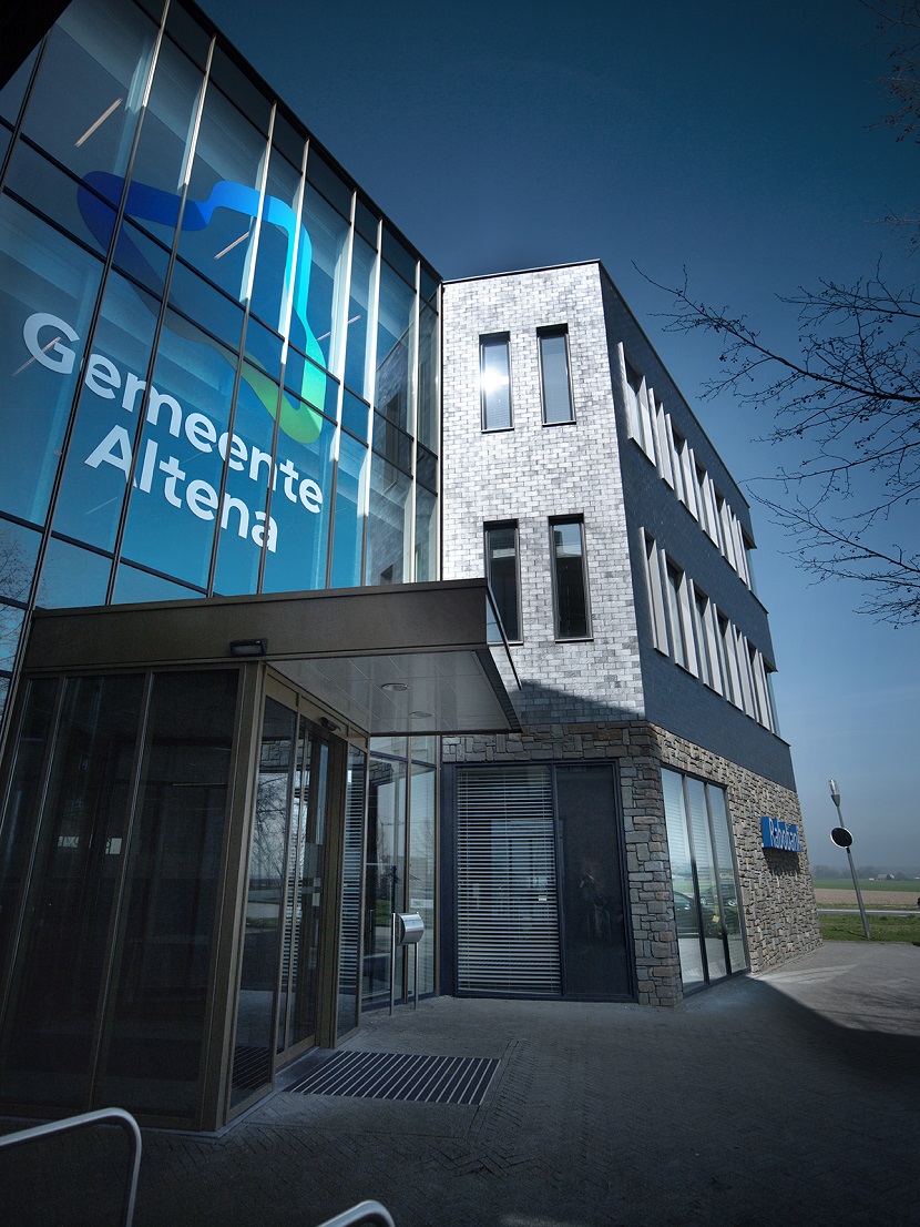
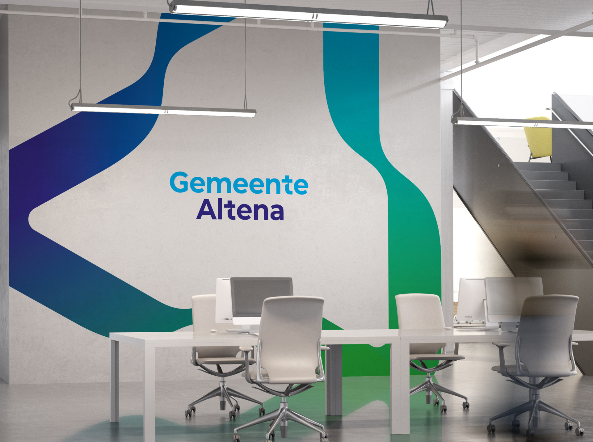
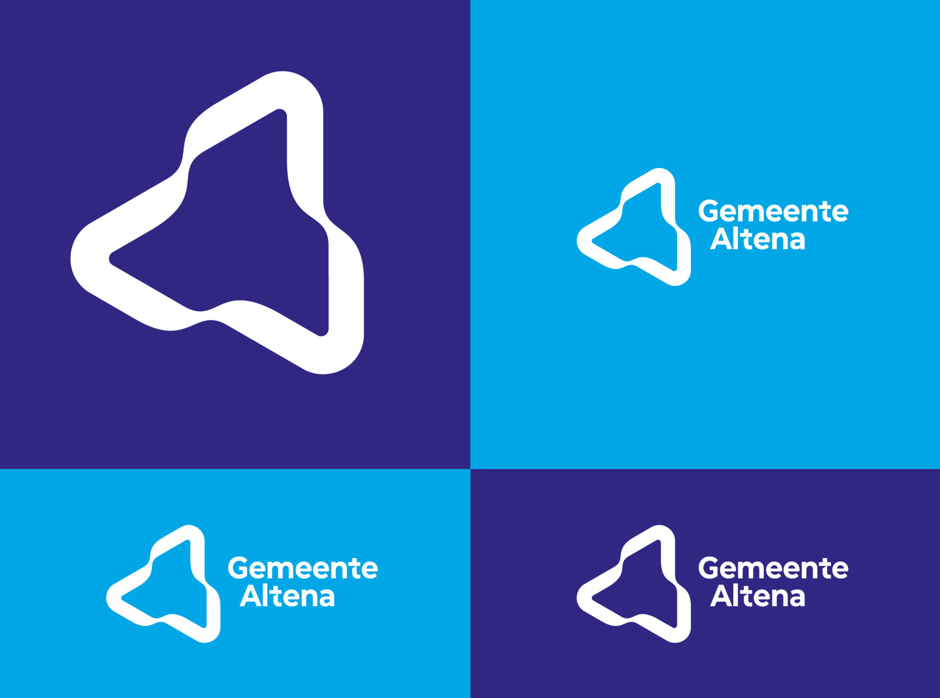
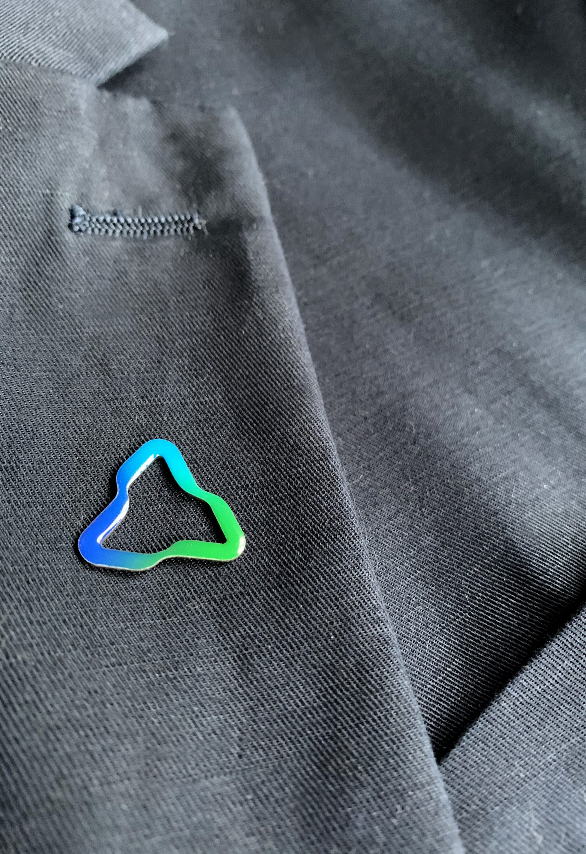
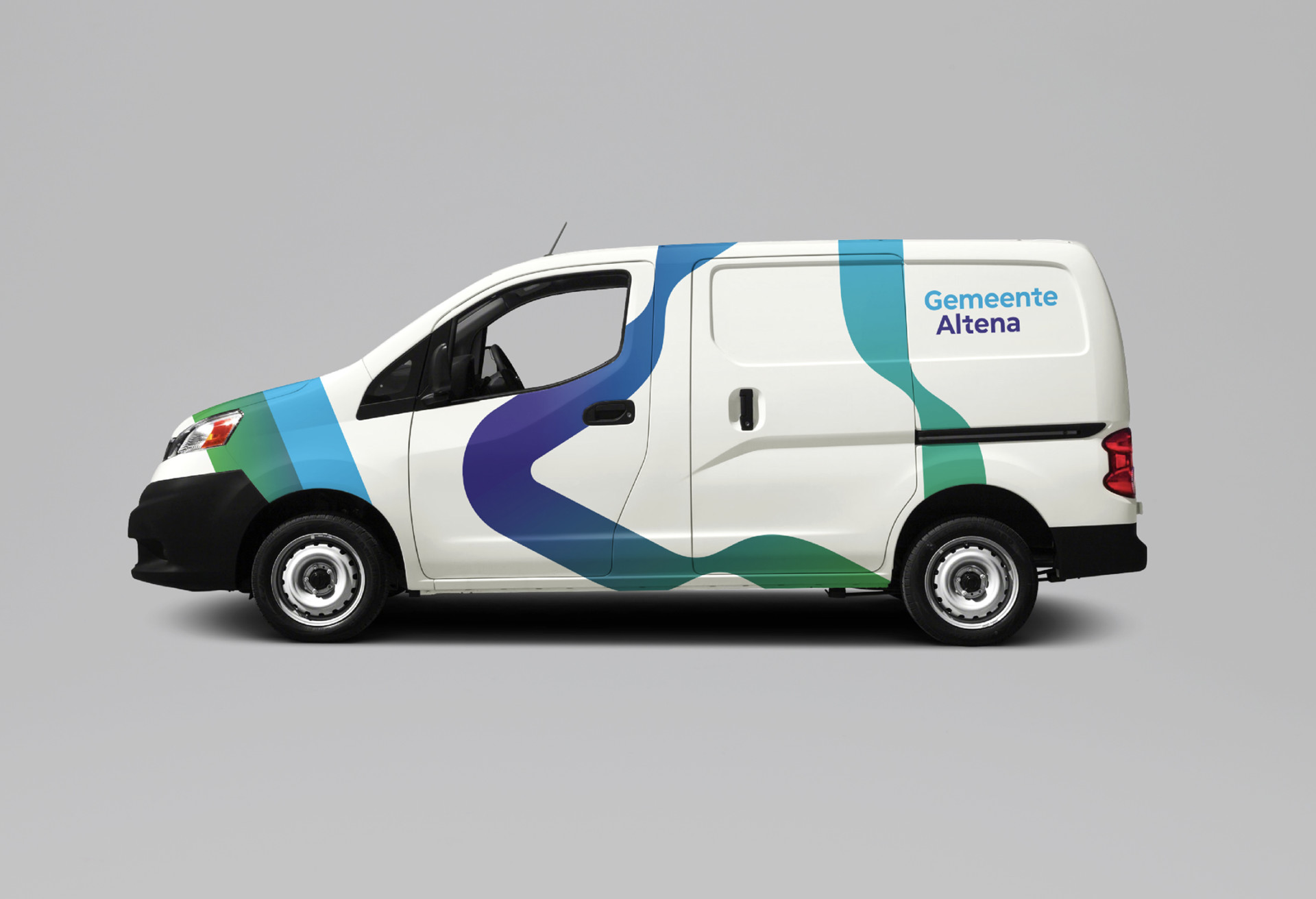
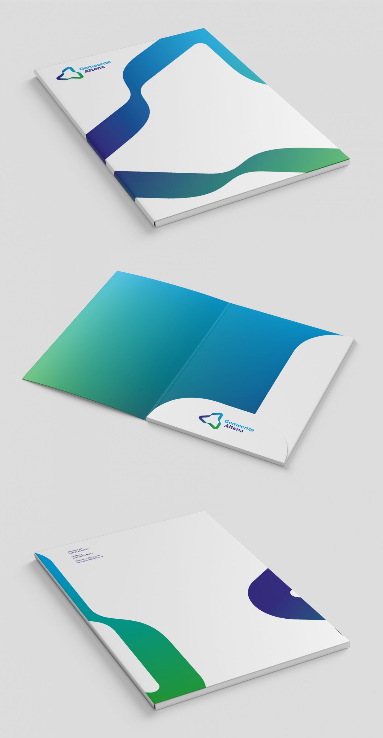
Our logo is a depiction of the geographic characteristics of the region: it’s completely surrounded by rivers; the source for a lot of local history/culture/businesses. The three colors flow and the dynamic quality of the logo mark stands for the great entrepreneurship in the region. But more importantly: it’s a display of unification.
This visual identity was made in close collaboration with communication agent Marianne Sijberden. We did a lot of research which involved citizens, local business holders, councils and politicians.
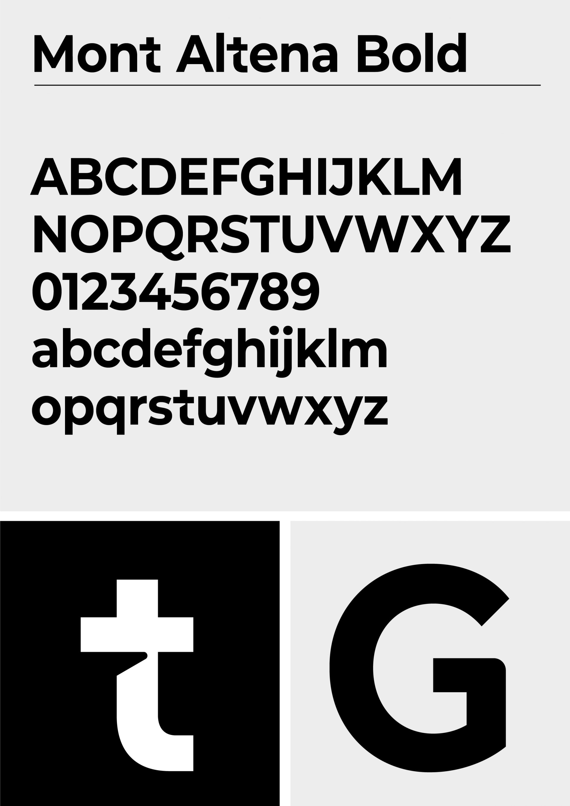
For this visual identity we took the open source Montserrat font and made it our own by altering some and adding different characters. Most notably the t, f and G. By doing so we ensure a great recognizability for the new municipality.
www.gemeentealtena.nl
Gemeente Altena